
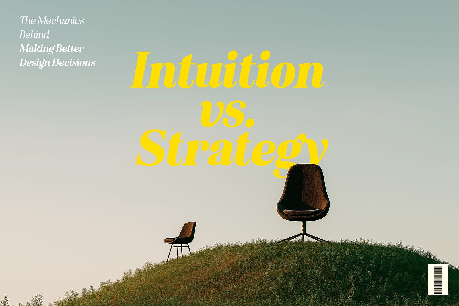
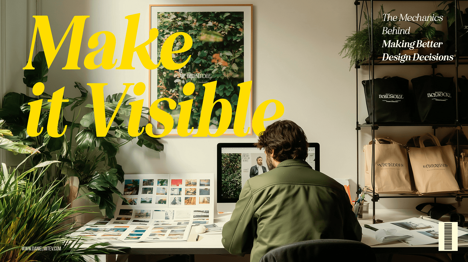
The Mechanics Behind Making Better Design Decisions
UX, UI, AI
Daniel Mitev
18 mins
Aug 13, 2025
Design decisions often seem simple on the surface, but beneath them involve a lot of thinking. This article covers what makes better design choices, with real-world examples and practical frameworks.
Here’s what we will cover:
Why design decisions aren’t as simple as they seem
The difference between junior and senior designers’ thinking, contrasting intuition-led vs. strategy-led approaches.
13 key questions senior designers ask before settling on a solution, covering everything from user value to accessibility.
The importance of articulating your rationale to earn trust with teammates and stakeholders.
The value of sharing your design story, and not just your output.
Lessons from movie characters like Sherlock Holmes and Morgan Freeman in Se7en, to illustrate how reflective decision-making works in practice.
Decision-making tools like matrices and checklists to reduce bias and structure thinking.
Common pitfalls to avoid such as chasing trends, ignoring user feedback, and overcomplicating simple problems.
How to handle decision paralysis, with practical steps to move forward when you’re stuck between good options.
Why context matters more than a one-size-fits-all solution, and how the right decision depends on users, goals, and constraints.
Summary: Better design decisions come from slowing down, asking the right questions, and communicating clearly. Practice these habits and you’ll not only design better, but also become a more trusted voice in your team.
The simple made complex
Should that button be blue or red? Should the navigation go at the top or bottom? Should we follow the latest glassmorphism trend or stick with tried-and-tested design?
Design decisions often masquerade as simple choices.
To the untrained eye or even to the newer designers, these questions may seem purely visual or stylistic. But to any experienced UI/UX designer, they know that behind every element placed or interaction designed is a combination of reasoning, research, and responsibility.
For instance, that trendy layout? It might conflict with accessibility guidelines. That smart animation? It could introduce cognitive friction for your target audience. Every decision is a balancing act between usability and delight, speed and scalability, brand and user need.
Design should be a practice of making the complex appear simple. However, that’s not always the case. Making design decisions involves understanding users deeply, aligning with business goals, and working within technical constraints.
As you can see, thoughtful design doesn’t happen by accident because it’s all engineered. In this article, we will dive deep and explore the mechanics behind truly informed design choices. Whether you’re navigating complex user flows or simply choosing between two icons, understanding the underlying forces can help you move from instinctive designing to intentional decision-making.
Intuition vs. strategy: How junior and senior designers decide
For newer designers, it’s easy to go with your gut. For instance, you see an awesome animation on a Dribbble shot and think, “That looks cool, I’ll do that!” Or you pick your favorite font because it feels right. And sometimes, those choices work. But more often, they don’t hold up when put in front of real users or real-world constraints.
Take this example:
A junior designer adds a carousel to showcase five new features on a homepage. It looks clean. It feels interactive. But the analytics later show only 15% of users ever click past the first slide.
Now compare that to a more seasoned designer’s approach.
The senior asks:
“Will users engage with all five features?”
“Do we have data that supports putting this in a carousel?”
“Could a simple vertical list or cards be more scannable?”
After weighing options, they might skip the carousel entirely and show all features at once. It’s more usable, less flashy, but way more effective.
It’s not that seniors hate trends…it’s just they’ve learned to zoom out!
Where a junior might ask, “What looks best?”, a senior often starts with, “What’s the goal?” or “What problem are we solving?”
Junior: “I love dark mode. Let’s make the whole app dark.” Or “This icon set looks minimal. I’m using it.”
Whereas,
Senior: “Our audience is mostly older adults. Will dark mode reduce readability?” Or “This icon might look nice, but is it universally understood?”
To summarize, this is how it goes in both a junior and senior designer’s minds:
Junior’s Thought Process | Senior’s Thought Process
“This looks modern.” | “Is this design appropriate for our users?”
“I saw this in a cool app.” | “What does our user research suggest?”
“Let’s try this animation.” | “Will this slow down task completion?”
“I like it this way.” |. “Will this support our business goals?”
From gut to guidance
Don’t get me wrong; this is not an article to criticize juniors and only give seniors the praise. We all start with instinct. A very normal thing.
But great designers learn to pause before deciding. They gather input, ask questions, test assumptions, and then make informed choices.
The flashy carousel might win views on dribbble, but the plain list might win users. In design, strategy always beats style, especially when users are involved.
Femke nails it when it comes to the importance of business context in design decisions:
Many designers get caught up in craft and aesthetics without connecting their work to actual business outcomes. It’s critical to have a good understanding of the business context behind every design decision. I see this constantly with mid-level designers who’ve mastered the visual and usability fundamentals but struggle to gain influence with leadership. They’ll spend hours perfecting a button style or debating color choices, but can’t articulate how their design decisions impact revenue, user retention, or operational efficiency.

Femke — Product designer and industry voice known for helping designers grow through practical, thoughtful guidance.
The senior designer’s checklist: 13 questions for better decisions
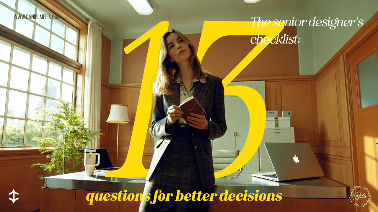
Design may be creative, but good decisions often come from discipline. Senior designers rely on a mental checklist and not just instincts to guide their choices. These 13 questions act as a framework to ensure every design decision serves users and hits goals.
Let’s walk through each one:
1. Are we solving the right problem?
First and foremost, ask yourself: What’s the actual problem here?
Example: Users can’t find how to update their billing info and as a result, they keep reaching out to support for help. A junior might redesign the billing page. But a senior digs deeper and realizes the real issue is poor visibility of the account settings link.
2. What’s the effort vs. impact?
Basically, measure how much work this could take, and is it really worth it?
Example: Introducing a personalized dashboard sounds great, but if it takes about 4–6 weeks to build and only helps 5% of users, it may not be the best use of time. Don’t you agree? Instead, a simple improvement to the existing layout could offer 80% of the value at 20% of the effort.
3. Is it standard practice?
Does this follow familiar UX patterns users already know?
Example: Instead of designing a custom toggle switch, use the OS-native one. Reinventing familiar patterns can confuse users without adding real value.
4. Will users find it familiar and intuitive?
Can users understand this without thinking too hard?
Example: Adding a confirmation for canceling a payment can be confusing for some users. A senior would simply go with “Cancel” because it aligns with their familiarity and reduces friction.
5. Is there previous user feedback or testing about this topic?
Have users already told us what they need?
Example: If usability testing showed users ignored your dropdown filter, don’t redesign it blindly. Start with what users said or struggled with.
6. How does it align with business goals or KPIs?
Does this help move the needle for the business?
Example: A redesign that improves onboarding clarity directly supports a key metric: conversion. Good design aligns with both user and business success.
7. Will this introduce new maintenance or support challenges?
Is the design adding long-term complexity?
Example: That animated 3D background might look awesome, but if it’s hard to maintain, bugs easily, or increases load time, it’s probably not worth it.
8. Can it scale in the future?
Will this still work as the product grows?
Example: A navigation bar designed for 3 items might break when the team adds 3 more features next quarter. A senior chooses a tab system that can grow gracefully.
9. Does it align with our design system?
Are we using the same components and patterns?
Example: Instead of creating a new custom modal, a senior uses the system modal component. It saves time, ensures consistency, and reduces development effort.
10. Is it accessible to all users?
Can everyone use this design, regardless of ability?
Example: Light gray text on a white background might look sleek, but fails contrast checks. A senior designer ensures designs meet WCAG standards so no user is excluded.
11. What are the risks or edge cases?
What could go wrong?
Example: A password field with a visibility toggle looks great, but is it secure on shared devices? Will it still work when users have slow connections? Senior designers think beyond the “happy path.”
12. What’s the impact on other parts of the product?
Does this change affect other flows or screens?
Example: Adding a new “Quick Book” feature sounds great, but does it confuse users who are used to the current flow? Will support docs and help videos need updates?
13. What can we learn from it?
Can we test or measure this to improve later?
Example: Instead of hard-coding a new layout, a senior proposes an A/B test. That way, they learn whether it truly improves engagement before going all in.
Why does this checklist matter?
These questions help you shift from guessing to guiding. You’ll make fewer arbitrary decisions and more intentional ones. They keep your work user-centered, aligned with the product, and mindful of the bigger picture. Before finalizing a design, pick 3 questions from this list and assess. If you are not able to get a clear answer to these questions, then that means it’s time to pause and explore further.
Articulating your rationale: Building credibility with stakeholders
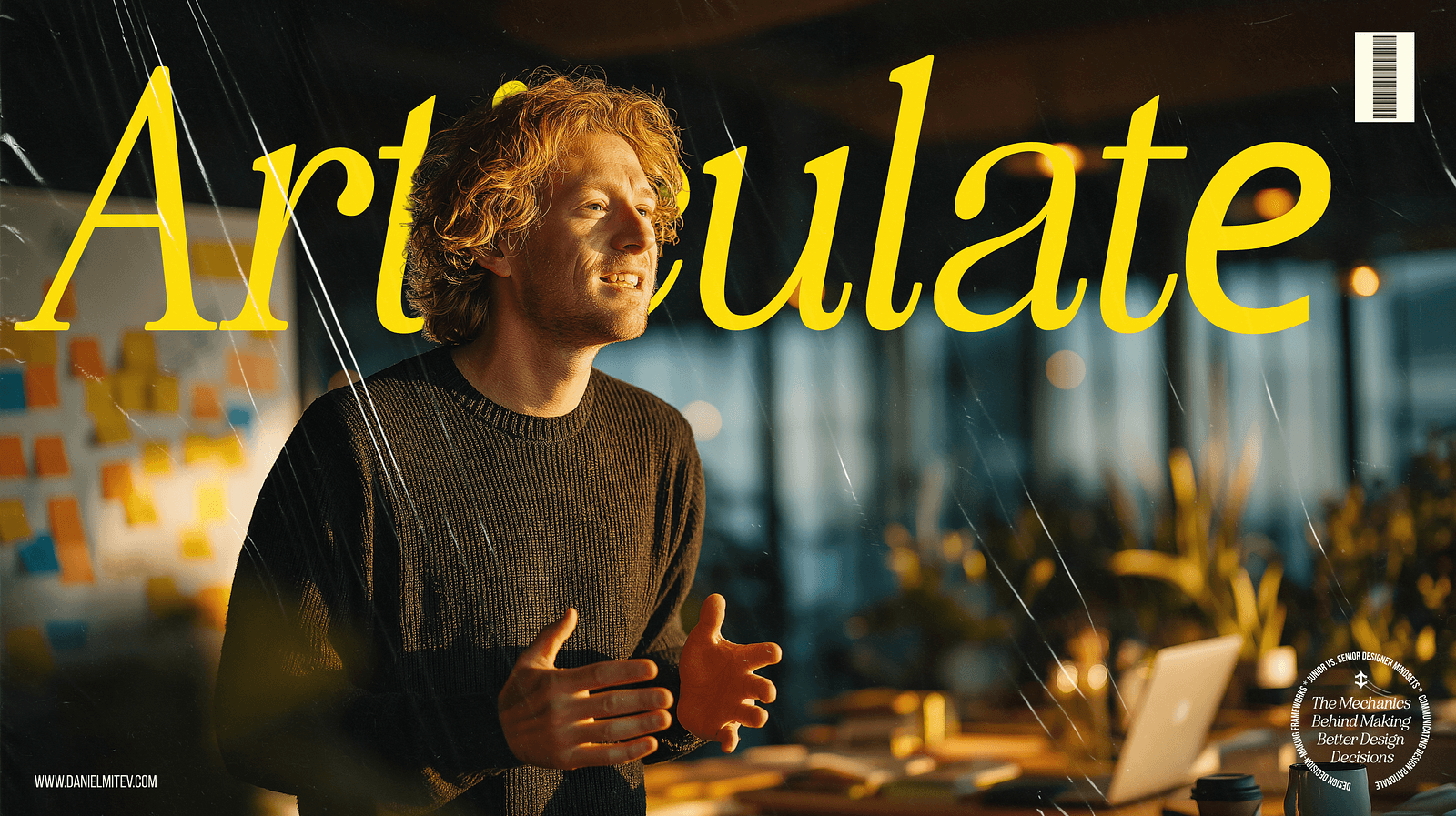
Making a solid design decision is important. The one thing that sets senior designers apart is their ability to explain their decisions clearly, confidently, and with context.
Rather than defending your work, focus on helping others understand your thinking. This includes why this layout, why that interaction, why not something else. When you can do that, you eventually build trust.
Good designers make decisions. Great designers explain them.
Let’s take an example. A checkout form was redesigned to improve conversion. Now, imagine being asked in a stakeholder review, “Why did we move the billing info below the shipping info?”
A junior might say:
“I just felt it flowed better that way.”
A senior would say:
“User testing showed that 70% of customers expected to enter shipping first. Moving billing below reduced confusion and form abandonment. It also aligns with our analytics from last quarter.”
That explanation changes everything. It shifts the conversation from opinion to insight. It’s no longer a design as an art but rather as a solution.
The anatomy of explaining a design choice
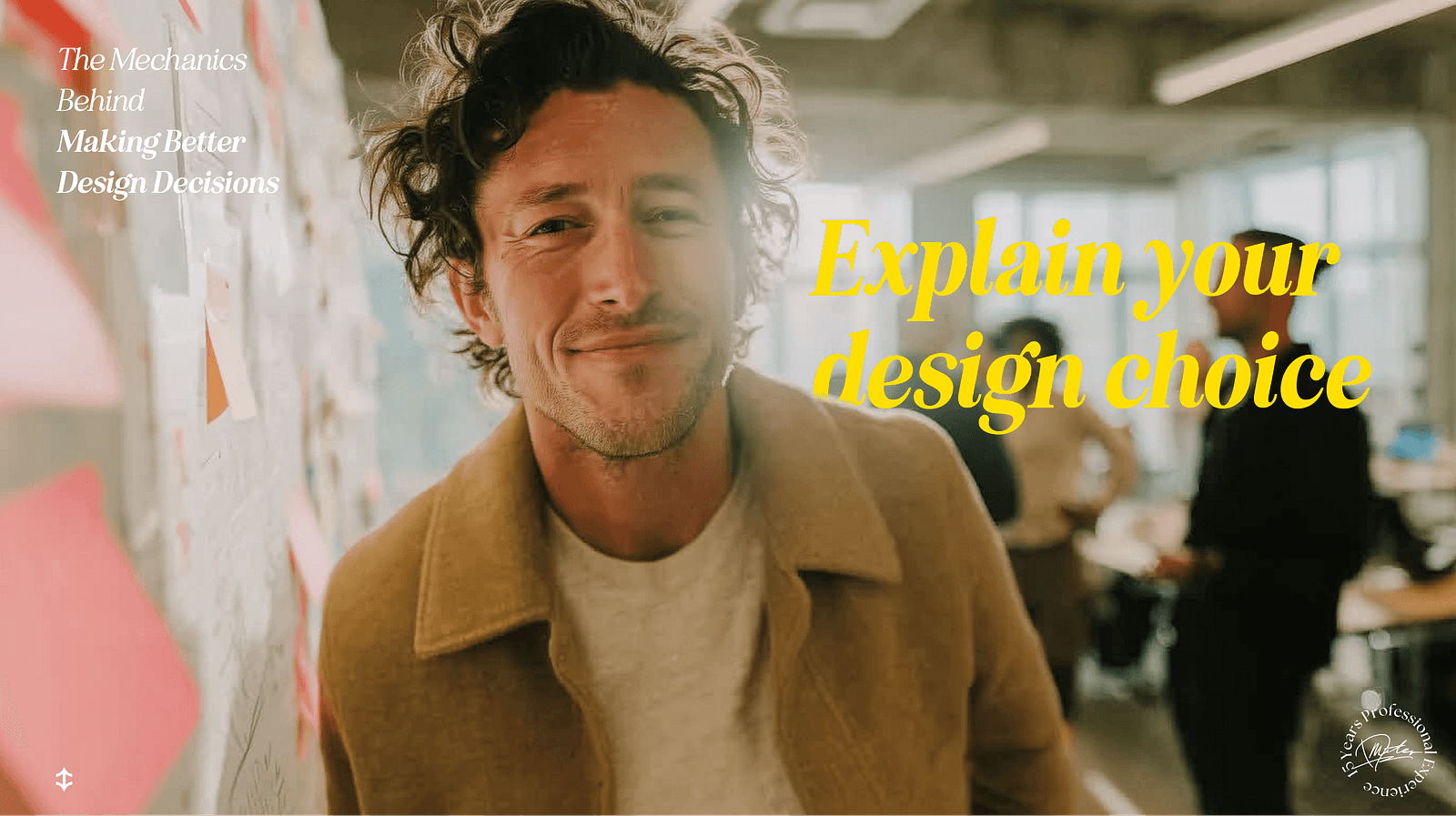
When you’re presenting or justifying a decision, try this simple structure:
What was the problem?
“Users were dropping off on this screen at a high rate.”What did we change?
“We simplified the form into two steps instead of four.”Why this solution?
“It reduced cognitive load, kept focus, and aligned with patterns users already understood.”How does it connect to user needs or business goals?
“This supports our KPI of increasing checkout completions and fits with our design system.”
Let’s add a practical example here. For instance, your design decision revolved around changing a text link to a prominent CTA button on a pricing page.
Here’s how to explain it:
“We noticed users were overlooking the link to start a free trial. It was low-contrast and not placed prominently. Based on heatmaps and user testing, we replaced it with a high-contrast button placed above the fold. Early results show a 22% increase in clicks to the sign-up flow.”
This shows research, rationale, and impact. It makes the design not just a guess, but a decision backed by insight.
Here are some quick tips for communicating design rationale:
Don’t just say what you did, but say why.
Frame explanations in terms others understand: users, data, goals.
Avoid jargon. Say “We made it easier to scan” instead of “We improved cognitive affordance.”
Invite feedback. It shows confidence, not weakness.
Make it visible
Take it up a notch and visually show your explanations. Here are simple ways to embed rationale into your design process:
Add callouts or sticky notes to Figma files explaining key choices.
Include a “Decision Highlights” section in your design specs.
Summarize “what we explored and why we chose this” in presentations.
Maintain a lightweight Design Decision Log.
And perhaps most importantly, you invite feedback and collaboration, turning a solitary choice into a shared outcome. Designs don’t speak for themselves. You do.
If you’re early in your career, speak up anyway.
It’s normal to feel unsure, especially as a junior designer. Maybe you think, “I don’t want to overexplain,” or “What if I sound wrong?” But here’s the truth: Sharing your thought process doesn’t expose weakness; it builds credibility.
When you say, “We tried three layouts, but users in testing found this version clearest,” you show leadership. You show empathy. You show that your design wasn’t a guess, but it was a decision.
A practical framework: Decision matrices and checklists

Even the most experienced designers get stuck. There’s too much input, too many trade-offs, and sometimes, too many opinions in the room. When the answer isn’t obvious, having a structured framework can turn chaos into clarity.
That’s where tools like decision matrices and checklists come in.
They don’t replace creativity, but they guide it. They help you step back, evaluate options fairly, and make confident choices based on what matters most.
The decision matrix: When you need to compare options logically
A decision matrix is a simple table that helps you compare multiple options against key criteria.
How it works:
List your design options in rows.
(e.g., Card layout, List layout, Grid layout)Define your decision criteria in columns.
(e.g., User impact, Dev effort, Business value, Accessibility)Score each option on a scale (e.g., 1–5) for each criterion.
Add up the scores to see which solution offers the best overall balance.
Here’s an example to illustrate this:
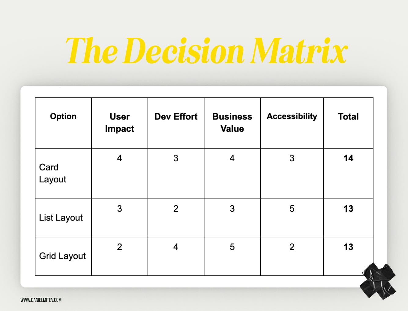
An example of a decision matrix
So, in this case, Card Layout wins by a narrow margin. But more importantly, the matrix shows why and sparks deeper discussion, not just opinions. One can use this tool to remove gut bias and turn sometimes heated debates into structured conversations.
How can these tools help?
They reduce decision paralysis. When everything feels equal, the matrix gives you a way to choose.
They help explain your choices. Stakeholders love seeing logic behind decisions.
They make your process repeatable. Use the same tools across projects for more consistent outcomes.
Here’s the best part: You don’t need fancy software or a Notion page. A pen and paper will do. Tools like decision matrices and checklists don’t decide for you, but they make you better at making it. They support clarity over chaos and help you back your creativity with confidence.
Common decision-making pitfalls to avoid
Here are some of the most common pitfalls, and how to sidestep them:

1. Prioritizing aesthetics over usability
The mistake: A common one that we could make is focusing on what looks appealing rather than what actually works for users.
Relatable example: A designer creates a sleek, minimal form with floating labels and low-contrast text. It looks stunning. But users can’t tell which field they’re typing in, or what the field is for.
How to avoid it: This is where we should revisit the checklist and ask: Can users complete their task easily? Never prioritize aesthetics over clarity or functionality.
2. Ignoring user feedback
The mistake: Brushing aside usability issues or complaints because “the design feels right” or “we already decided on it.”
Relatable example: A team launches a new dashboard layout. Multiple users report that they can’t find key filters. However, the team decides not to change it, assuming that they’ll get used to it.
How to avoid it: Stop seeing feedback as noise and treat it as data. It signals to revisit design decisions. If five or more users stumble on the same step, it shows that it’s not their fault.
3. Overlooking the business context
The mistake: Designing in isolation from product goals or success metrics.
Relatable example: A redesign adds delightful microinteractions and animations to a booking flow, but slows down the overall completion rate, frustrating users and harming conversions.
How to avoid it: Tie design decisions back to KPIs. Ask, “Does this help users and the business?” Balance creativity with outcomes.
4. Overcomplicating the solution
The mistake: Solving a simple problem with a complex or clever interface.
Relatable example: To help users filter content, a designer builds a multi-tabbed modal with sliders, toggles, and collapsible sections, when a simple dropdown could’ve done the job.
How to avoid it: Start with the simplest version that could work. Ask, “What’s the least the user needs to get this done?” Then build up only if needed.
5. Chasing trends blindly
The mistake: Adopting the latest design trend without considering whether it suits the product or audience.
Relatable example: You redesign an app with glassmorphism because it’s popular on Dribbble, but now users with vision issues can’t distinguish buttons from the background.
How to avoid it: Trends can inspire, but don’t let them dictate. Test ideas in context. If it doesn’t help your users, it doesn’t belong in your product.
The reality is that every designer makes mistakes, but experienced designers notice them sooner. One can steer clear of these common traps by staying curious and open to feedback. As a result, you make smarter, stronger design decisions.
How to handle decision paralysis
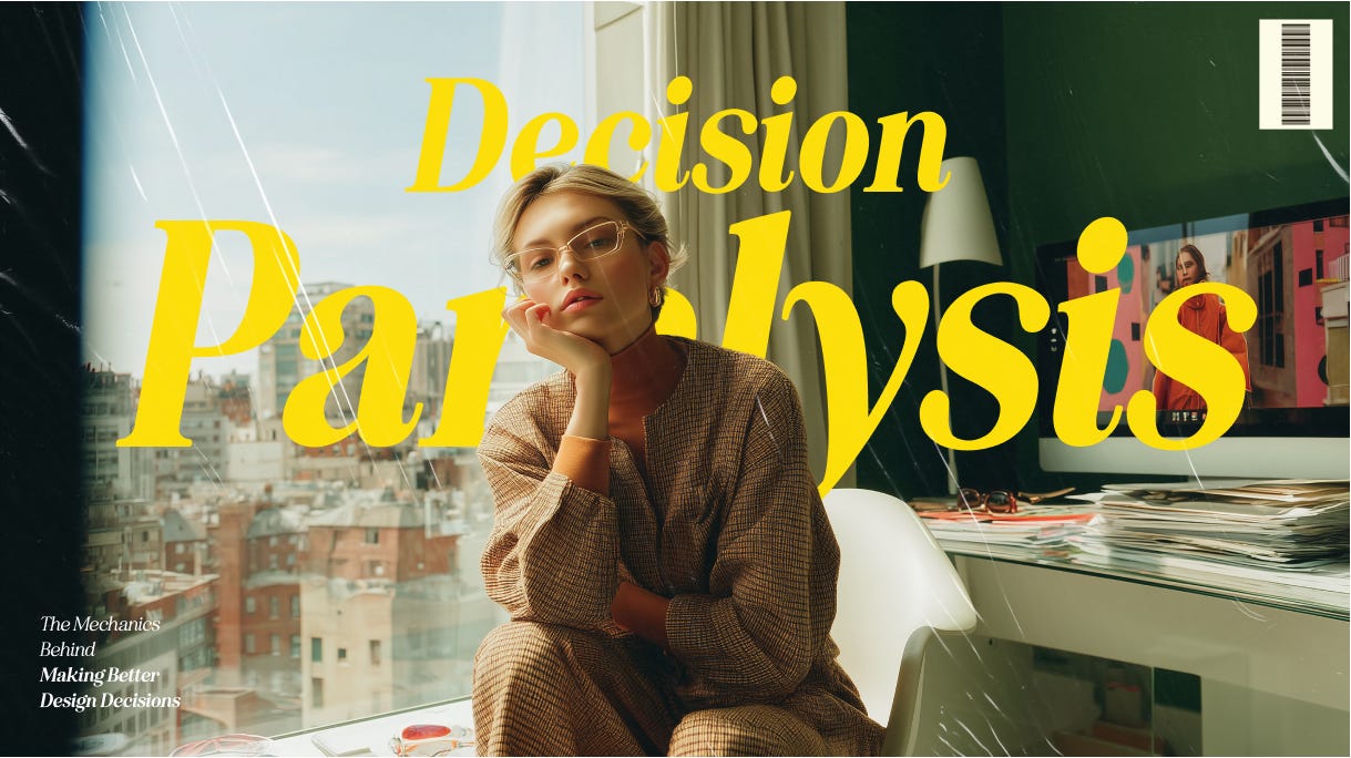
Sometimes, the problem isn’t a lack of ideas but that there are too many good ones. For instance, you’ve explored multiple layouts, color schemes, and interaction flows.
All of them could work and there are no wrong answers. But the more you weigh them, the harder it feels to choose. This is decision paralysis, and it happens to everyone, including senior designers.
The good news is that there are simple, practical ways to move forward without second-guessing every step.
Decision paralysis hits everyone, even the best
Decision paralysis isn’t just something junior designers face. It’s a shared challenge, even for the leaders in the industry. The more experienced you become, the more variables you’re aware of, which ironically, can make decisions even harder.
Take it from Femke, a respected voice in the design world, who shared how she personally works through this:
Decision paralysis hits us hard as designers because we see all the potential problems which affect our ability to make confident decisions. We know better than to “just pick something,” but perhaps don’t have all the information at hand to make an informed decision.
To move past this, I do a few things:
- Time-box the decision — give myself a hard deadline to make the decision
- Consider running an experiment — small experiments let me test and iterate quickly
- Break it down — instead of redesigning an entire dashboard, how can I ship this incrementally with a few users first?
- Consider the goal — remind myself what we’re trying to achieve and ask “which one of these best helps us achieve the goal?”Suddenly, “good enough” becomes acceptable. Perfect information doesn’t exist, but delayed decisions definitely hurt products. Design decisions aren’t permanent, we can always iterate based on real user feedback rather than hypothetical concerns.
Remember: iteration beats paralysis every time. Your next version will be better than your never-shipped perfect one.
But wait! Why do we get stuck in the first place?
When all options seem equally valid
Fear of making the “wrong” choice
Pressure to please different stakeholders
Lack of clear criteria for evaluation
How to break free from it?

Here are proven strategies to overcome decision paralysis in a design context:
1. Use a decision matrix
Structure the choice with a simple scoring system. Just like you saw earlier with our example, assign values to criteria like usability, dev effort, user feedback, and business impact. For example, if Option A scores higher across most criteria than Option B, you’ve got a direction. It turns “gut feelings” into guided decisions.
2. Prioritize by goals
Ask: What matters most right now? Is it speed to market? Accessibility? Scalability? Once you align on a priority, some options naturally fall away. For example, if your top goal is to improve accessibility, the cleanest, highest-contrast UI should likely win, no matter how stylish the alternatives look.
3. Get a second opinion
Pull in a teammate, developer, PM, or fellow designer, and quickly walk them through your options. Fresh eyes = fresh clarity. They may spot a strength or flaw you missed.
4. Test, don’t guess!
If it’s hard to choose, that’s a great signal to prototype and test. You don’t have to get it perfect. You just need to validate what works. Even simple user feedback can help you move forward with confidence.
5. Default to simplicity
When in doubt, go with the simplest viable option. You can always evolve it later. Starting with complexity can be much harder to undo.
Remember: You don’t have to be 100% sure; you just need to be clear enough to move forward. In design, iteration is your safety net. Paralysis feels overwhelming, but it’s often a sign that you’re being thoughtful. Use simple tools, set priorities, and lean on your team. Progress beats perfection every time.
Context is key: No one-size-fits-all solution
Here’s a truth that takes time to accept in design:
There’s rarely one “correct” answer.
You might create two very different solutions to the same problem, and both could be right. It all depends on context.
Why context matters
Design decisions don’t live in a vacuum. They’re shaped by the product, the audience, the team, the business model, and even the timeline.
A highly interactive UI with gestures and animation might be perfect for a Gen Z social app, but a poor fit for an internal tool used by busy finance teams who just want speed and clarity.
Or take this, for example:
Product A: A consumer-facing travel app targets digital natives. A bold, modern interface with swipe interactions feels intuitive and delightful.
Product B: An enterprise HR system is used by employees in their 50s with limited tech familiarity. A clean, conventional layout with clear buttons and labeled fields works far better.
Same problem: navigating between sections. Two completely different UI decisions. Both valid.
Senior designers get comfortable with ambiguity

As designers grow, they stop chasing the best solution and start asking:
“What’s best for this user?”
“What works in this context?”
“What fits our goals and constraints right now?”
They might abandon a sleek new pattern, not because it’s bad, but because it doesn’t match their user base, tech stack, or business priorities. That kind of trade-off is maturity in action.
Reframing “right” and “wrong”
New designers often worry: “What if I choose the wrong solution?”
But the better question is: “Did I choose the right solution for this moment, this product, and these people?”
Even great design systems adapt. Patterns that work in one company don’t always transfer cleanly elsewhere. What matters is whether your choice serves your users, supports your business goals, and works within your constraints.
That’s the “sweet spot” where good decisions live. When you design in context, you don’t just build products. You build trust!
Bottom line: Practice, reflect, and communicate with confidence
To wrap it up, better design decisions don’t happen overnight but built over time through trial, feedback, and reflection.
Whether you’re just starting out or leading a design team, every project is an opportunity to improve on how you think, decide, and communicate your decisions.
Let’s be real! You’ll face moments of uncertainty, trade-offs that feel tough, and times when “good” isn’t exactly clear-cut. That’s normal. It’s part of design.
What matters is how you respond to those moments.
Use your checklists to stay grounded.
Reach for a decision matrix when you feel stuck.
Reflect on what worked and what you would do differently next time.
And above all, share your thinking. Let others see what you made and why it matters.
You don’t have to be perfect, just thoughtful
Remember, there’s rarely one perfect answer. Because context shifts, users surprise you, and teams evolve. But the thing is when you approach decisions with care, you’ll be miles ahead. The more you practice, the more confident and trusted you’ll become.
So here’s your next step:
On your next task, try out that checklist. Score your options in a matrix and share your design story with your team. You might be surprised how much more trust you earn and how much stronger your designs become.
Thoughtful decisions + clear communication = powerful design.
And you’ve got everything you need to start making both.
References:
Cimpan, A. (2024, March 25). Articulating design decisions — the power of effective communication. Medium; Bootcamp. https://medium.com/design-bootcamp/articulating-design-decisions-the-power-of-effective-communication-7ade2402c194
Decision Matrix for Design and User Experience Teams. (2024, January 17). Larksuite.com. https://www.larksuite.com/en_us/topics/project-management-methodologies-for-functional-teams/decision-matrix-for-design-and-user-experience-teams
10 Common UX Design Mistakes and How to Avoid Them — UXVerse — 𝗨𝗫◦𝗨𝗜 𝗗𝗘𝗦𝗜𝗚𝗡𝗘𝗥 — Medium. (2025, February 3). Medium. https://medium.com/@UXVerse/10-common-ux-design-mistakes-and-how-to-avoid-them-fd025154a1cc
Read more:

AI Integration in UX Design: Enhancing User Experiences

Unlocking Success: How a UX Strategy Consultant Transforms Brands
Building AI Products with Great UX: Mastering the Text Prompt

How Can We Reduce Stress for Users?

Why UX Is Moving From Execution to Judgment

UX Research in 2026: When AI Takes the Work and Leaves Us the Weight

The Quiet Shift Changing UX
Synthetic users: is there a place for “AI-generated users” in UX Research?
The Mechanics Behind Making Better Design Decisions

Is mobile-first approach killing your website’s potential?