
iOS 26 Liquid Glass Feels Great Until You Have to Use It
OS, Apple, UX, UI
Daniel Mitev
10 min
Jan 21, 2026
iOS 26 introduces Liquid Glass, a translucent, animated visual language that changes how controls, navigation, and content coexist on screen. In real use, the system increases visual competition, reduces predictability, and tightens touch targets. This article breaks down where usability suffers and why these patterns matter beyond Apple.

What is Liquid Glass in iOS 26?
Summary: Liquid Glass adds translucency, refraction, and motion to interface controls across the system.
Apple describes Liquid Glass as a translucent material that reflects and refracts its surroundings while dynamically transforming to bring focus to content.
In practice, it means UI elements float above content and borrow color and texture from whatever sits behind them. It looks modern in screenshots. It feels less stable during repeated use.
Liquid Glass changes the default relationship between interface and content. Controls stop being a clear layer on top. They become part of the background.
Why does transparency make interfaces harder to use?
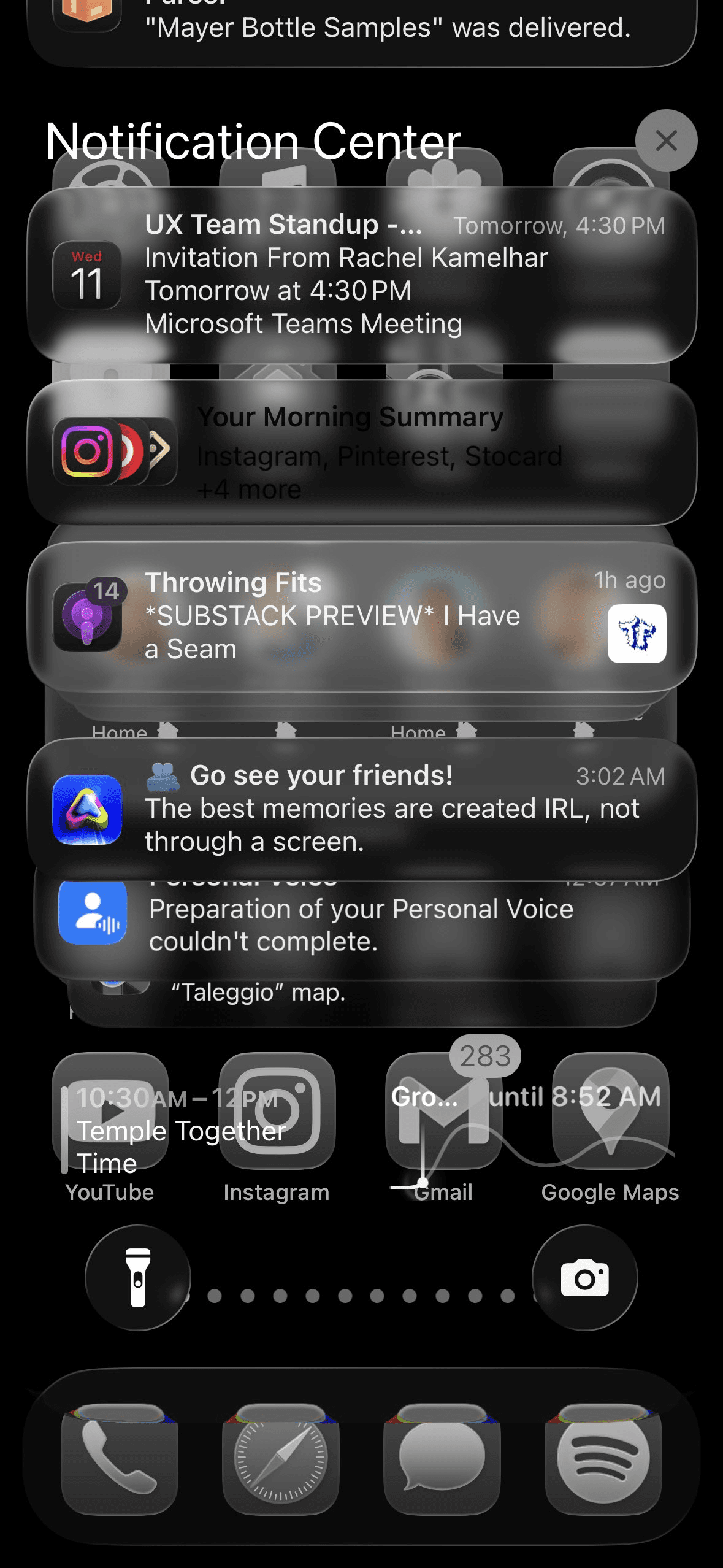
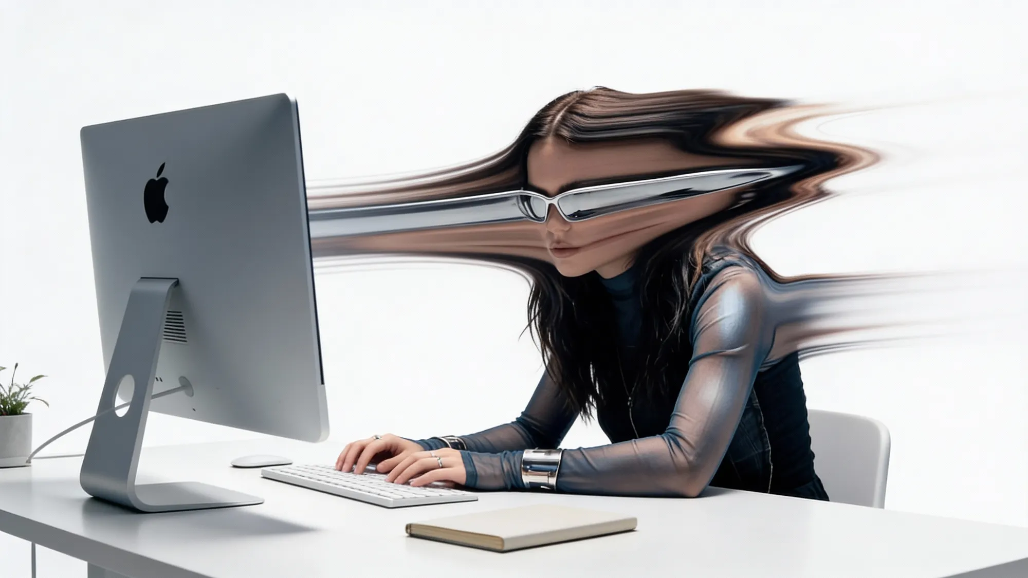
Image: Mert Erdir
Summary: Transparency reduces legibility and makes controls compete with content.
A simple rule keeps showing up in usability research across decades. When you place something on top of something else, it becomes harder to see.
Text and icons rely on contrast. Transparency reduces it. Even blur and frosting do not fully solve this when backgrounds are busy or change as you scroll.
This becomes especially painful in real scenarios:
Text placed over photos or complex imagery
Icons that blend into cards, maps, and media
Search fields that disappear into lists and previews
Layered text on top of text, where the eye has no stable anchor
Key insight: Visual lightness is not the same thing as visual clarity.
What happens when motion shows up everywhere?

Summary: Motion draws attention even when the user gains nothing from it.
Animation can signal change, confirm action, and reduce uncertainty. It can also become noise.
In iOS 26, motion appears constantly:
Buttons pulse and shimmer
Controls morph between shapes
Elements animate even when the user did not trigger them
Navigation shifts as you scroll and repositions components
This makes the interface feel active. It also keeps pulling attention away from the task.
Key insight: Motion has a cost. Your eyes pay it every time.
Over time, the issue is not delight. The issue is fatigue. Repeated distraction reduces flow and increases friction, even if each animation lasts only a moment.
Are tap targets and spacing getting worse in iOS 26?
Summary: Denser layouts increase mis-taps and raise interaction effort on mobile.
Touch interactions depend on spacing, target size, and predictable positioning. Mobile use happens in imperfect conditions: one hand, glare, movement, interruptions, divided attention.
iOS 26 packs more into the bottom area of the screen while also introducing floating controls that sit apart from the rest. Some navigation bars feel cramped, while one control gets emphasized disproportionately.
The result is a UI that asks for more precision. Users do not gain more capability from that precision. They gain more chances to miss.
Key insight: Small targets punish normal human hands.
Why does predictability matter so much in everyday UX?
Summary: Predictability is what allows interfaces to become automatic.
Usability improves when users can build habits. Habits form when the interface stays consistent.
iOS 26 introduces controls that:
Appear and disappear depending on context
Collapse and expand based on state
Change the size and location of targets over time
This forces re-scanning. It slows down repeat behavior. It makes the UI harder to learn because the user cannot rely on muscle memory.
Key insight: Interfaces become easy when users stop thinking about them.
What conventions changed, and why does that cause friction?
Summary: Moving long-established patterns increases short-term effort and relearning.
Search moved in meaningful ways across apps. Patterns that lived at the top of pages now show up at the bottom and remain persistent.
New users might find this easier in certain cases. Existing users lose speed because habit breaks before a new pattern becomes automatic.
The same theme shows up in navigation cues. Breadcrumb-style back labels disappear in places, leaving users with less orientation. The back arrow remains, but the context vanishes.
Key insight: Familiarity is a usability feature users earn over time.
Is discoverability getting worse in iOS 26?

Summary: When labels disappear and controls hide, users spend more time hunting.
Discoverability fails quietly. The user does not report it as a bug. They pause. They scan. They hesitate. They tap twice. They open a menu to confirm what they already knew yesterday.
In iOS 26, several choices reduce discoverability:
Back buttons losing their descriptive label
URLs shrinking and truncating, reducing trust signals
Tabs moving behind overflow menus
Floating bars interfering with content and competing with in-page actions
Each change adds a small tax. Small taxes become expensive at scale.
Key insight: Extra steps do not stay small when repeated all day.
The bigger picture for designers
Summary: iOS 26 shows a system-level tradeoff where visual expression increases interaction effort.
iOS 26 blends Liquid Glass translucency, persistent motion, denser navigation, collapsing controls, and shifting conventions into one system.
The combined effect matters more than any single pattern. It changes the baseline of what “normal” interaction feels like.
For product teams, the lesson is practical.
Visual systems can look premium while still reducing usability if they:
Compete with content
Reduce contrast
Move controls across states
Tighten touch targets
Remove labels that provide orientation
Key insight: Aesthetic polish does not guarantee operational clarity.
Closing
Liquid Glass looks clean from a distance.
In daily use, it increases visual ambiguity, raises attention cost, and weakens predictability. It asks users to work harder to read, tap, and navigate.
Good interfaces feel calm.
They make the task the center of attention.
That calm is harder to find in iOS 26.
Read more:

AI Integration in UX Design: Enhancing User Experiences

Unlocking Success: How a UX Strategy Consultant Transforms Brands
Building AI Products with Great UX: Mastering the Text Prompt

How Can We Reduce Stress for Users?

Why UX Is Moving From Execution to Judgment
UX Research in 2026: When AI Takes the Work and Leaves Us the Weight
The Quiet Shift Changing UX
Synthetic users: is there a place for “AI-generated users” in UX Research?
The Mechanics Behind Making Better Design Decisions

Is mobile-first approach killing your website’s potential?