Why dark patterns are more effective than you think
UX, User Behaviour, UI
Daniel Mitev
11 min
Jan 11, 2025
Discover how knowledge of dark patterns can help designers craft more transparent and user-focused experiences. This article sheds light on how recognizing manipulative techniques can guide designers toward practices that genuinely prioritize and advocate for users’ needs. Ethical design can boost user engagement and trust, turning design challenges into opportunities for creativity and ethical integrity.

The other day, I visited an online store for a new sweater. After adding a sweater to my cart, a message appeared: “Hurry! Only 1 left in stock!” Feeling a sudden urgency, I clicked “Buy Now” in seconds without hesitation.
Later, I learned that this warning was triggered for every item in the store, regardless of actual stock levels. This isn’t a coincidence but a carefully crafted manipulation or, in other words, a “dark pattern.”
If you are a marketer, you may applaud its genius tactic for creating urgency and scarcity. But as a designer by trade, I was more intrigued to learn about its ethical usage.
I did a little digging online and found a survey by Dovetail that over 40% of respondents reported that they had experienced unplanned financial consequences due to dark patterns.
So, I wasn’t the only one to fall for these tricks.
Dark patterns are undeniably controversial; they raise ethical concerns and often provoke a backlash in the design community.
Yet, their persistent use and success prompts an unsettling question: Why are these tactics so effective? And could there be valuable lessons within their success?
Hence, this article will dive into the psychology behind dark patterns, their widespread use, and what we can learn from their power to influence user behavior.
The Sinister Designs Hiding in Plain Sight
Dark patterns are notably deceptive design strategies crafted to nudge users toward taking actions that may not truly serve their best interests.
Unlike transparent and ethical designs, dark patterns exploit our cognitive biases and psychological tendencies to drive specific outcomes.
Some common examples of dark patterns include:
Disguised Ads: Ads that blend seamlessly with the surrounding content, often tricking users into clicking on them, thinking they’re part of the website or app’s main content.
Disguised ads (Brignull, 2010), Misdirection (Brignull, 2010, Mathur et al., 2019),
Forced Continuity: Users sign up for a service and are not warned that, unless they actively cancel, they will be billed continuously. For example, many streaming services make it easy to sign up but a daunting task to cancel, with cancellation options hidden deep within settings.
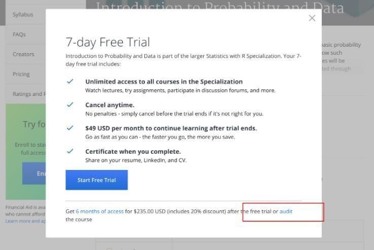
b: Forced continuity hiding the free offering deep, shown in red box Link
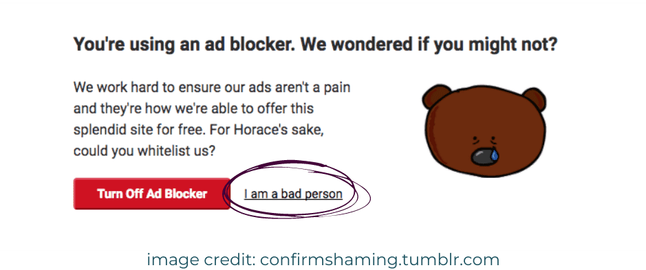
Confirmshaming: These designs make users feel guilted or shamed for not taking an action they don’t want to take otherwise. For example, if they don’t want to buy travel insurance, a dark pattern would show “No, I will take the risk”.
View all types here.
But Why Do They Exist?
Obviously, they work. Otherwise, why are many websites, apps, and other interfaces using them?
The primary motivation behind dark patterns lies in their capacity to drive business-related results.
By creating a sense of urgency, hiding information, or making processes ambiguous, in this way companies can increase conversions, retain customers longer, and store valuable user data.
Yet, the ethical line between engaging design and manipulation is a fine one. One that dark patterns frequently cross.
Diving Deep into the Psychology Behind Dark Patterns
Dark patterns skillfully exploit various cognitive biases or mental shortcuts that influence our decisions, often unconsciously.
For instance, here are a few cognitive biases that are commonly targeted:
Fear of Missing Out (FOMO): Many dark patterns tap into our anxiety about lost opportunities. This was what happened to me when I browsed an online store for a sweater. Display messages like “Only 1 left!” or “Offer ends in 2 minutes!” These countdowns make users feel super-urged to act, even if the scarcity or the deadline isn’t real.
Loss Aversion: Studies show people are more sensitive to losses than to equivalent gains. Hence, when “abandoned cart” notifications remind users of items left behind, it creates a fear of losing access to something they’ve shown interest in, even if they initially decided against buying.
Patience: Subscription services frequently employ dark patterns to make cancellation difficult. For example, streaming services make users navigate several steps, usually making them work across multiple screens to cancel successfully. By implementing such tedious opt-out procedures, companies influence users to lean towards staying subscribed to their services out of fatigue.
For instance, take a look at IONOS when it comes to implementing such tedious opt-out procedures.
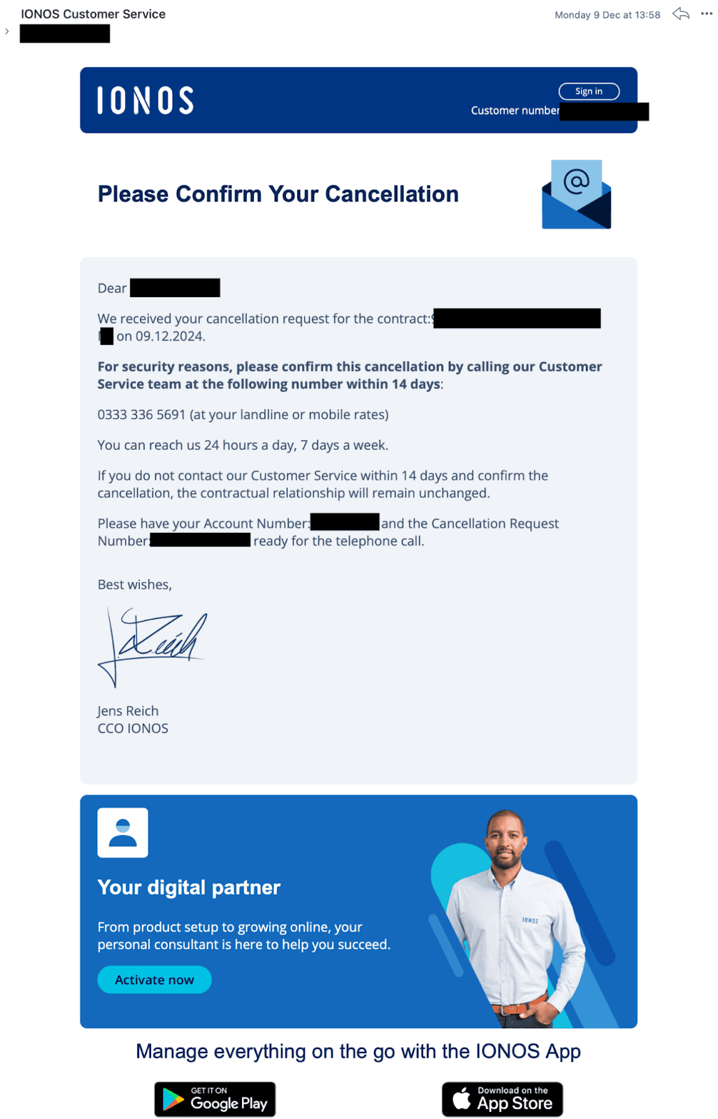
Source: Reddit
Signing up is hassle-free, but canceling it requires users to make a phone call. Now, who would have the patience to go through all of that just to cancel a subscription?
Default Bias: People tend to go with pre-selected options to avoid the effort of changing defaults. This is why many websites make the opt-in box for marketing emails pre-checked. Users are more likely to accept the default, giving companies access to personal information or consent for promotional contact.
Some companies design patterns in which users have no choice but to choose a pre-selected option to complete a transaction.
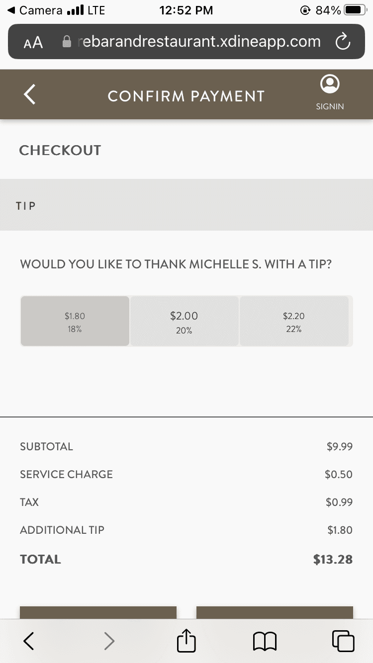
Example of pre-selected options. Source: Reddit
For example, in the image above, you can see that the user has no choice but to tip the server to confirm the payment. There is no way to unselect any options.
In a nutshell, these tactics rely on human tendencies to avoid discomfort, act quickly, and save effort, which dark patterns take full advantage of.
Dark Patterns Instantly Gratifies Businesses…But This Can Be Dangerous
Dark patterns are powerful tools for companies because they deliver immediate, measurable results. Businesses measure these results using critical metrics like conversion rates, click-throughs, and engagement rates.
For example, when you look at many e-commerce websites, they implement many of these “Only a few left” or “Only 1 left” to see reduced cart abandonment rates. This compels users to hit the buy button quickly.
As a result, businesses get instantly gratified. They can see tangible benefits with minimal investment in time and resources. Therefore, this reinforces the temptation to use these manipulative tactics over and over again.
However, the effectiveness of dark patterns is best illustrated through real-world examples where companies leveraged these tactics to meet business goals, often with significant ethical concerns.
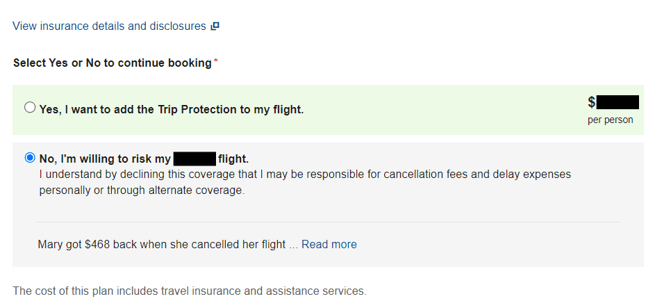
Ryanair’s “Opt-Out Insurance”
Let’s look at Ryanair. A well-known airline that once faced scrutiny for automatically adding travel insurance to ticket purchases, forcing customers to uncheck a box to remove the charge.
Yes, this tactic resulted in higher revenue per transaction because many users didn’t notice the pre-selected option or felt pressured to keep it. While this approach increased profits in the short term, it eventually also led to complaints.
Ryanair isn’t the only airline that has implemented such a trick with travel insurance. Here’s American Airlines doing the same:
Source: Reddit
In this example, not only they confirmshame users into buying travel insurance but also use a peer-pressure tactic with someone benefiting from purchasing travel insurance in the past.
Amazon Prime’s Difficult-To-Cancel Setup
Another example we can look at is none other than Amazon Prime. The mega giant streaming service was criticized for intentionally complicating the cancellation process.
Subscribers wanting to leave faced multiple screens and hidden options and were even bombarded with offers to continue the service at discounted prices rather than cancel. These cleverly implemented barriers helped the company to retain more subscribers over time.
However, the tactic drew widespread backlash from users who felt trapped in a “Roach Motel” dark pattern, and amazingly, even the FTC charged Amazon for these deceptive tactics. This goes to show that this is not only an ethical concern but can be a legal issue too.
But that’s not the only dark pattern one can see on Amazon Prime. Here is another example of how cleverly they increase transactions for their subscription:
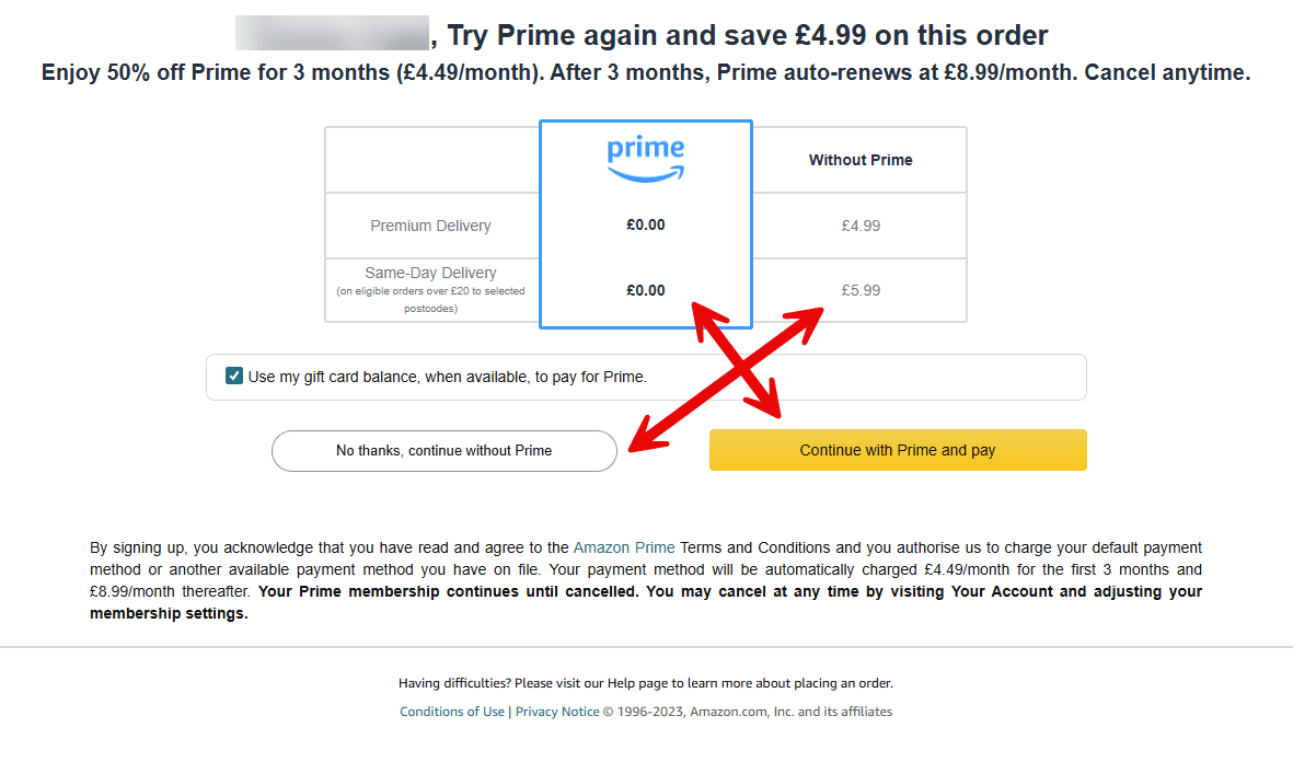
Source: Reddit
As you can see, not only do they make the “Continue with Prime and pay” button stand out in yellow, but they also carefully place the CTA under the column “Without Prime.” On the other hand, users are more likely to avoid clicking the first button as it is placed under the “Prime” column.
Here’s another dark pattern Amazon implemented on their return page.
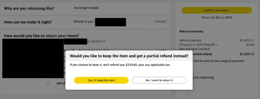
Source: Reddit
As you can see, users would naturally hit the yellow button, but if they didn’t read properly, they would know that Amazon is only offering a partial refund and allowing users to keep the rejected item. Thus, another example of where users aren’t able to execute their desired outcomes due to patterns like these.
But the major problem is not that. One big reason dark patterns are so successful is that most users don’t recognize them for what they are. These designs blend seamlessly into the interface, masking the manipulation behind familiar web design elements. Even when we suspect manipulation, we often lack the time, energy, or motivation to resist them.
Short-Term Gains over Long-Term Trust? The Ethical Dilemma
Dark patterns have raised an ethical dilemma for companies, making them ponder whether is it even worth implementing them.
There is a tempting trade-off: they deliver short-term gains but at the potential cost of long-term trust.
When users eventually recognize they’ve been manipulated, their trust in the brand erodes, and many become less willing to engage in the future. Customers who feel deceived will not only avoid a brand moving forward but are also more likely to spread negative reviews.
For instance, a company might see a temporary spike in conversion rates by using “subscription traps” that make canceling difficult, but once users feel trapped, they’re less likely to return or recommend the service to others.
This trade-off reveals an ethical tension: businesses may benefit in the short term, but they risk losing the loyalty that fosters sustainable success.
User Backlash Can Get Ugly
When users become more and more aware of dark patterns, backlash is created, often fueled by consumer rights advocates and social media.
I mean, take a look at this deceptive checkbox from Nextdoor for example:
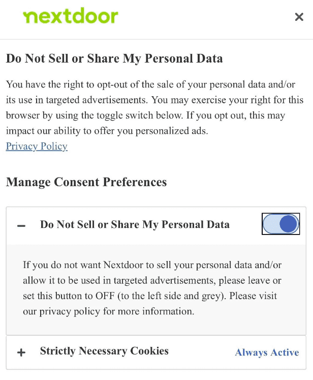
Source: Reddit
The toggle header says that it won’t share or sell personal data but the description below suggests it to turn it off so it won’t sell personal data. This creates massive confusion for users and may even question the integrity of the company.
You will find disgruntled users are quick to call out manipulative tactics, exposing companies publicly and amplifying their grievances. Designer Harry Brignul started such an initiative by creating a “Hall of Shame” for companies that used dark patterns.
This increased transparency has led to a more vocal demand for ethical design practices. Companies are beginning to realize that deceptive tactics may no longer be worth the short-lived benefits.
As users become savvier and regulations more stringent, the pressure to adopt ethical design practices grows, and the need to prioritize long-term trust over quick wins becomes clear.
What Can Ethical UX Designers Learn From This?
Okay, so far, I have focused a lot on the negativity of dark patterns and the companies that use them to bring them into our community.
But allow me to flip the script. Although dark patterns are often seen as the “villains” of UX design, they reveal a deep understanding of user psychology and behavior. The success of dark patterns depends on designers’ understanding of cognitive biases, emotional triggers, and decision-making shortcuts.
So… ethical UX designers can draw from this knowledge, recognizing that insights into human psychology are powerful tools — tools that, when used responsibly, can enhance user experiences rather than manipulate them.
For instance:
Loss Aversion: Instead of exploiting users’ fears of missing out, designers can use this bias to help users make informed decisions. For example, instead of aggressive notifications about limited stock or expiring offers, provide clear information about product benefits or upcoming sales, allowing users to plan their purchases without pressure.
Positive Use of Urgency: Convert the ‘dark pattern’ of urgency into a tool for good. Rather than pushing users with misleading countdowns, use gentle reminders for beneficial actions, like health apps encouraging users to stay active with notifications based on their activity goals. This turns pressure into motivation without deceit.
Transparent Opt-Outs: Rather than hiding cancellation options in convoluted menus (a common dark pattern), make these options easy to find and understand. This could include straightforward steps on how to cancel subscriptions, paired with reminders of upcoming renewals, allowing users to make decisions that suit their current needs.
Transparency Nudges: Use design nudges to enhance clarity rather than confuse. For example, clearly display all fees and renewal terms before a user commits to a purchase or subscription.
Personalization: Tailor experiences to individual users based on their behavior and preferences. This could mean suggesting products or services that genuinely match their past interests, rather than employing generic sales tactics.
Consent-Driven UI: Design interfaces that prioritize user consent, particularly for subscriptions and data collection. This shows respect for user preferences and builds trust by making data privacy and subscription terms transparent.
Value-Driven Incentives: Motivate users with actual value rather than manipulative tactics. Offer genuine reasons for users to engage with a service, such as exclusive content or personalized recommendations, which can enhance their experience and encourage loyalty.
Clear Benefits and Choices: Highlight the real benefits of each option available to users. For instance, if offering premium features, clearly explain what these features do and how they can help the user, rather than simply defaulting choices that might not be in their best interest.
Turning Dark Patterns into a Light of Hope…
It must be said that dark patterns demonstrate just how powerful it can be to understand human behaviour.
By tapping into cognitive biases and emotional triggers, they reveal the remarkable effectiveness of psychologically driven design. Nevertheless, many choose to use them to exploit users with deceptive tactics.
This effectiveness highlights an important takeaway for UX designers: while dark patterns may achieve business goals, they come at the cost of user trust and long-term brand loyalty.
As designers, we have a choice. The same psychological insights that make dark patterns so compelling can be utilized ethically. By prioritizing transparency, consent, and user-centered design, we can build interfaces that engage users without deception and foster user trust and loyalty.
So, as the industry advances and more users become aware of manipulative practices, the question remains: Can we redefine effectiveness in UX design without compromising ethics?
The future of user experience hinges on our ability to strike this balance.
References/Sources Used:
Deceptive Patterns — Hall of Shame. (n.d.). Deceptive Design. https://www.deceptive.design/hall-of-shame
FTC Takes Action Against Amazon for Enrolling Consumers in Amazon Prime Without Consent and Sabotaging Their Attempts to Cancel. (2023, June 21). Federal Trade Commission. https://www.ftc.gov/news-events/news/press-releases/2023/06/ftc-takes-action-against-amazon-enrolling-consumers-amazon-prime-without-consent-sabotaging-their
Loss aversion — Biases & Heuristics | The Decision Lab. (2019). The Decision Lab. https://thedecisionlab.com/biases/loss-aversion
McMillen, J. (2024, March 27). Who Uses Dark Patterns? A Breakdown Of E-Commerce Bad Practices. Forbes. https://www.forbes.com/sites/jennmcmillen/2024/03/27/who-uses-dark-patterns-a-breakdown-of-e-commerce-bad-practices/
New Research Finds Online Consumers Are Falling Victim to Dark Patterns. (2023, December 14). Dovetail. https://dovetail.com/product-development/new-research-finds-online-consumers-are-falling-victim-to-dark-patterns/
12 Dark Patterns in UX Design [And How To Avoid Them]. (2021, June 3). CareerFoundry. https://careerfoundry.com/en/blog/ux-design/dark-patterns-ux/#confirmshaming
Read more:

AI Integration in UX Design: Enhancing User Experiences

Unlocking Success: How a UX Strategy Consultant Transforms Brands
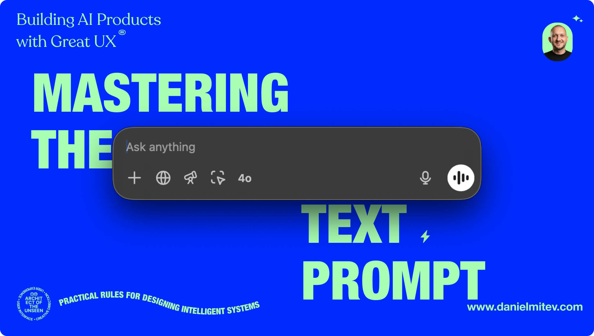
Building AI Products with Great UX: Mastering the Text Prompt

How Can We Reduce Stress for Users?

Why UX Is Moving From Execution to Judgment
UX Research in 2026: When AI Takes the Work and Leaves Us the Weight

The Quiet Shift Changing UX
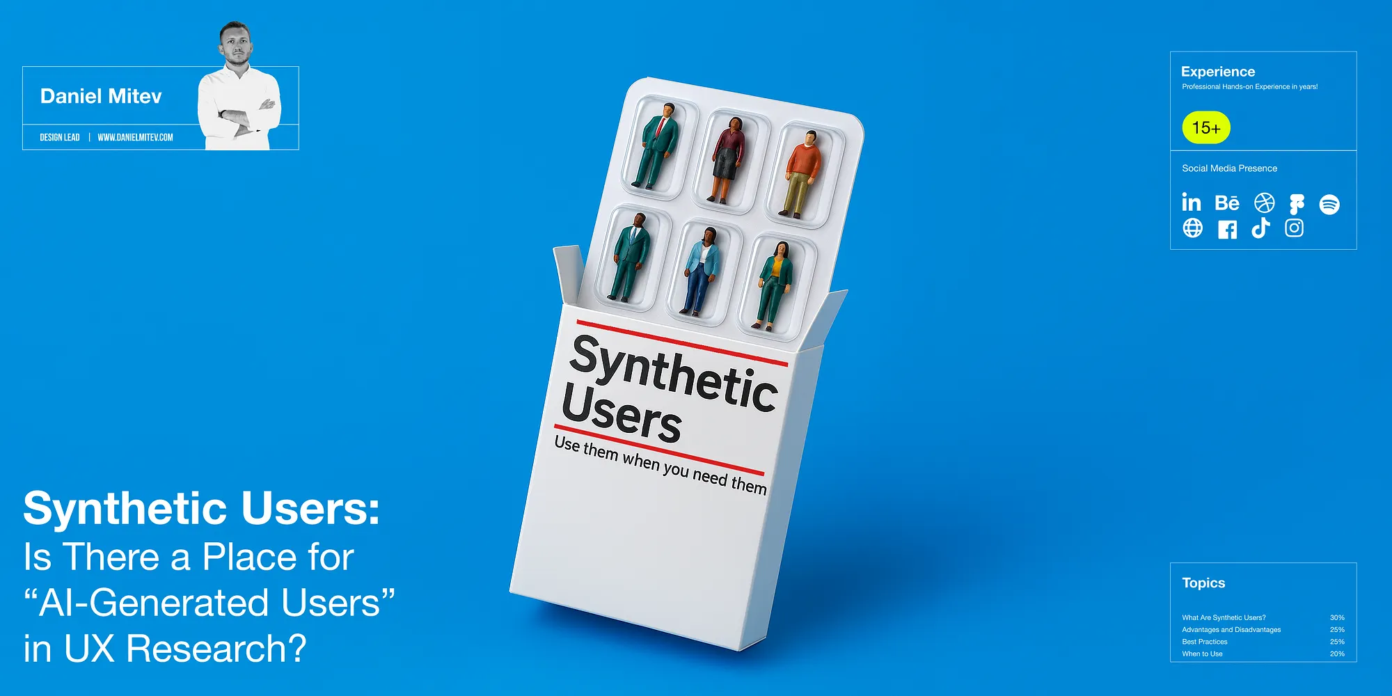
Synthetic users: is there a place for “AI-generated users” in UX Research?
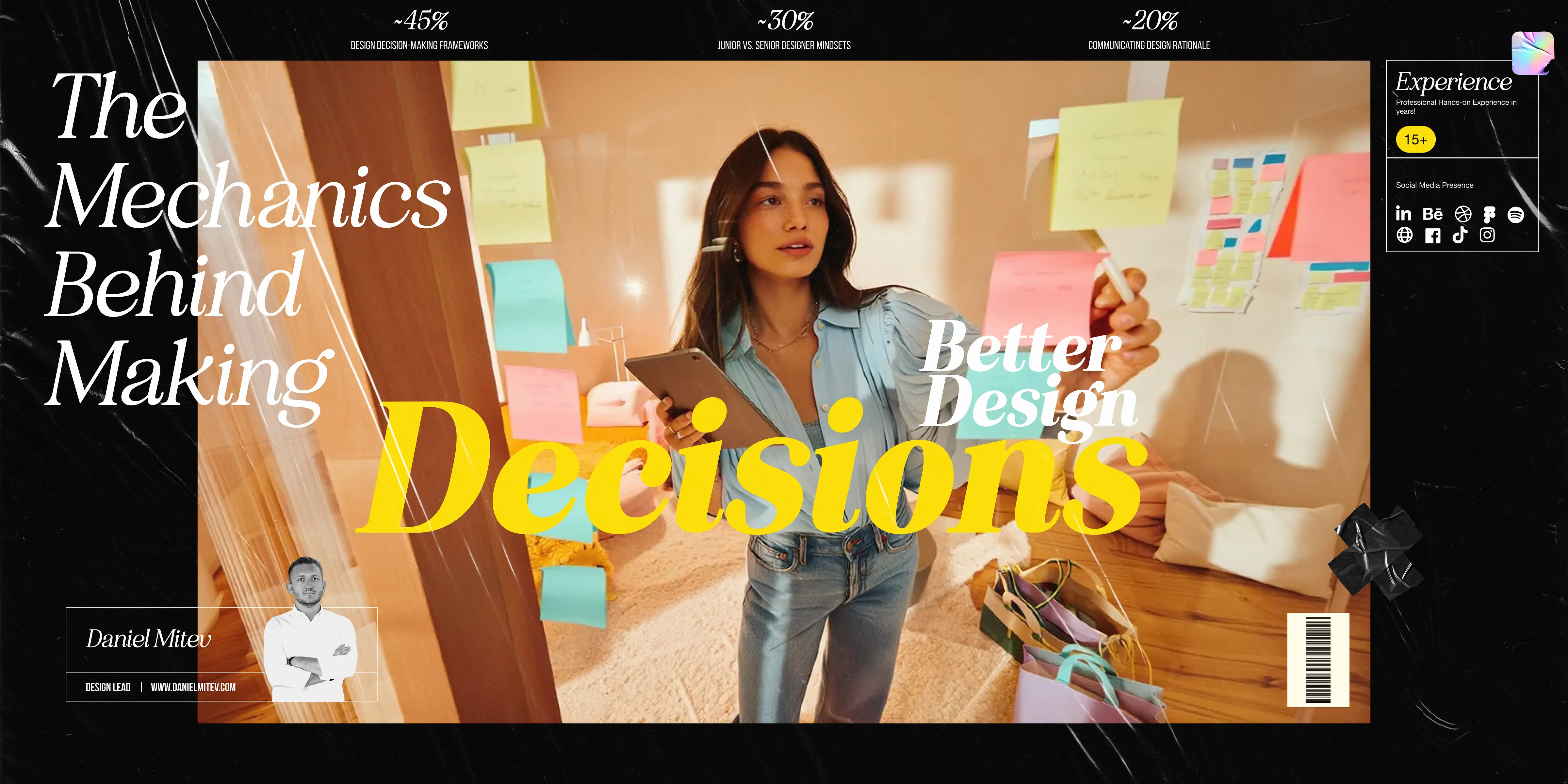
The Mechanics Behind Making Better Design Decisions

Is mobile-first approach killing your website’s potential?