How Can We Reduce Stress for Users?
Accessibility
Daniel Mitev
7 min
Feb 11, 2026
Design with calm in mind. Reduce pressure before it turns into friction.
How Can We Reduce Stress for Users?
Stress rarely comes from a single dramatic failure.
It builds from small frictions.
A countdown timer.
A button that moves.
An error message that feels like a warning instead of guidance.
Not everyone processes information at the same speed. Not everyone makes decisions comfortably under pressure. Designing with that in mind is one of the simplest ways to improve usability.
Reducing stress is not about adding more features. It is about removing unnecessary pressure.
Why Time Pressure Increases Errors

Example of scarcity urgency in ux, booking.com
A common pattern in digital products is artificial urgency.
Forms that expire.
Checkout timers.
Warnings that suggest you have seconds left before losing everything.
There are legitimate use cases for time limits, especially in high-demand scenarios. However, most flows do not require that level of urgency.
There is strong research backing the idea that time pressure harms usability. A study published in Decision Sciences titled “The Influence of Task Interruption on Individual Decision Making: An Information Overload Perspective” (1999) found that interruptions and time constraints increase cognitive load and significantly reduce decision accuracy. Similarly, research published in Psychological Bulletin titled “Heuristics Made Easy: An Effort-Reduction Framework” (2008) explains that when mental effort rises, people rely on simplified decision shortcuts, which often lead to poorer outcomes. When users feel rushed, they make more mistakes, experience more friction, and perceive interfaces as more difficult than they actually are. Removing unnecessary time limits is not a cosmetic improvement. It is a usability decision grounded in cognitive science.
When someone is buying museum tickets, applying for a service, or filling out a medical form, the experience should not feel like a countdown. If time limits are required, offer transparency and control. Allow users to extend the session. Show what will happen if time expires. Replace panic with clarity.
Reducing time pressure directly improves accuracy and confidence.
Predictability Reduces Cognitive Load
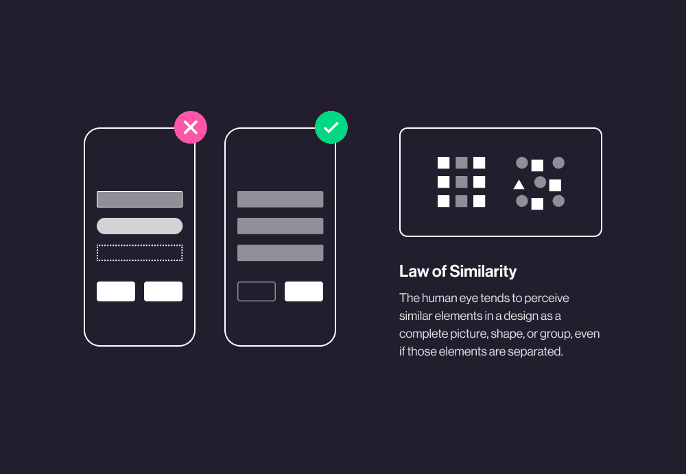
Law of Similarity by Hannah McGean
Predictability is one of the most powerful tools in UX.
Consistent navigation.
Stable button placement.
Clear interaction patterns.
These reduce the mental effort required to complete a task. Users do not need to relearn the interface on every screen. They build habits. Habits reduce stress.
This is especially important for users with cognitive disabilities. Sudden layout shifts, unexpected pop-ups, or automatic redirects interrupt concentration. Even small visual changes can create confusion.
Predictable systems feel calm. Calm systems feel trustworthy.
Clarity Over Complexity

Vague instructions increase anxiety.
Overly technical language creates hesitation.
Interfaces should say what they mean in direct, understandable terms. Replace abstract labels with concrete actions. Explain consequences before they happen.
Breaking complex processes into smaller steps also helps. Clear progress indicators signal how far a user has come and what remains. This transforms uncertainty into structure.
Structure reduces stress because it reduces ambiguity.
Error Handling That Supports, Not Punishes

Errors should not feel like failure.
Instead of blocking progress with generic warnings, offer inline validation and specific guidance. Tell users exactly what went wrong and how to fix it.
Allow undo actions.
Confirm irreversible decisions.
Provide recovery paths.
Control lowers anxiety. When users know they can reverse a mistake, they move forward with more confidence.
Designing for Pace

People absorb information differently. Some skim. Some read carefully. Some need extra time to process options before committing.
Allowing users to proceed at their own pace is one of the most respectful things a designer can do. It signals that the product adapts to humans, not the other way around.
Small adjustments can make a significant difference:
Remove unnecessary countdown timers
Allow session extensions
Keep layouts stable
Use consistent interaction patterns
Provide clear, simple instructions
Offer helpful error recovery
These are not dramatic redesigns. They are decisions rooted in empathy and responsibility.
Stress Is a Design Variable
Life already contains enough pressure. Digital products should not amplify it.
When we reduce mental load, increase predictability, and design for clarity, we create experiences that feel steady. Steady systems encourage trust. Trust supports long-term use.
Reducing stress is not an aesthetic choice. It is a usability strategy backed by research and human psychology.
Design can be a source of relief.
That is worth aiming for.
References:
Speier, C., Valacich, J. S., & Vessey, I. (1999). The influence of task interruption on individual decision making: An information overload perspective. Decision Sciences.
https://doi.org/10.1111/j.1540-5915.1999.tb01613.x
Shah, P., & Oppenheimer, D. M. (2008). Heuristics Made Easy: An Effort-Reduction Framework. Psychological Bulletin.
https://doi.org/10.1037/0033-2909.134.2.207
Read more:

AI Integration in UX Design: Enhancing User Experiences

Unlocking Success: How a UX Strategy Consultant Transforms Brands
Building AI Products with Great UX: Mastering the Text Prompt

How Can We Reduce Stress for Users?

Why UX Is Moving From Execution to Judgment

UX Research in 2026: When AI Takes the Work and Leaves Us the Weight

The Quiet Shift Changing UX
Synthetic users: is there a place for “AI-generated users” in UX Research?
The Mechanics Behind Making Better Design Decisions

Is mobile-first approach killing your website’s potential?
